Currently, this case study is under construction for tablet and mobile views and is only available on desktop view.
Currently, this case study is under construction for tablet and mobile views and is only available on desktop view.
ASU CFO Site Redesign: Simplifying Access to Financial Information

Live Site: https://cfo.asu.edu/
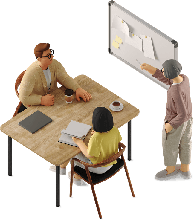
UX Designer & Researcher
Role
team
1 UX Specialist,
2 Content Writer,
1 Project Manager
time duration
July 2024 - May 2025
Improve access to financial resources on the CFO site to reduce support load, boost user satisfaction, and support ASU’s operational efficiency.
BUSINESS OBJECTIVE
problem space
Students, faculty, and staff often struggled to find essential financial information on ASU’s CFO site due to confusing navigation and dense content, leading to frustration and increased support requests. The experience needed to be simplified and made more intuitive to better serve the ASU community.
70% - Struggled with finding information
30% - Frustrated by unclear or outdated content
challenges
The site had a lot of complicated content that made sense to finance teams but was confusing for everyday users. It was hard to organize everything in a way that worked for everyone: students, staff, and faculty without losing important details. On top of that, we had to make sure the design followed ASU’s brand and accessibility rules, which added extra layers to every decision.

Too Much Complexity
One Site, Many Needs
Content Overload
Rules & Restrictions
results
After launching the redesigned CFO site, we saw measurable improvements in usability, user satisfaction, and overall engagement. These results reflect the impact of user-centered design and close collaboration with stakeholders.
46%
Increase in task success rate
25%
Increase Time spent on the website
48%
Improvement in user satisfaction score
Strategic Solution
My approach focused on delivering a user-centered redesign that addressed key usability pain points while aligning with ASU’s broader digital standards. The solution was guided by four core goals:
Improve content findability by restructuring the site’s navigation and information architecture.
Enhance user trust and engagement through a modern, accessible, and responsive UI.
Streamline user journeys by reducing time-to-task and minimizing unnecessary page visits.
Ensure alignment with ASU’s brand and full compliance with WCAG 2.2 accessibility standards.

research
Understanding User Needs and Pain Points

6 out of 12
Struggled to find basic financial or HR-related information due to confusing site structure.

65% of users
Said the site felt “overwhelming” with dense text and unclear labeling.

1 in 3 users
Resorted to contacting support because they couldn’t locate what they needed on the site.

2.1 minutes average
Time taken to find commonly searched pages like Payroll or Travel Reimbursement.

Every 3rd user
Described the site as “cluttered” or “outdated,” decreasing trust in the content.
10 out of 12 users
Wanted quicker access to commonly used resources like pay schedules and reimbursements.
1
8 out of 12 users
Clicked through multiple irrelevant pages before reaching the right one.
2
3 out of 12 users
Found the site search tool unhelpful and relied on Google instead.
3
7 out of 12 users
Weren’t confident the content was current or accurate, citing date confusion.
4
Crucial Insights from Research

themes & insights

-Users were unsure if they were viewing the latest or correct information.
-Users often got lost and weren’t sure where to go next.
- Users often relied on Google instead of using site menus.
- Internal search returned broad or irrelevant results.
-The layout felt cluttered and visually inconsistent.
- Poor visual hierarchy made it hard to find important information quickly.
Medium Fidelity Wireframes
EHS Training
Before


After
Redesigned the EHS Training page based on user support feedback. Replaced hard-to-navigate tabbed content with clear card-based layout and action buttons. Added sidebar navigation and student access information to improve usability and content discoverability.
Office Safety
Before


After
Improved page clarity and visual hierarchy by replacing cluttered, text-heavy content with a grid-based layout. Collaborated closely with content writers to streamline messaging and enhance navigation.
I tested Medium Fidelity wireframes with 2 users to get feedback.
4 Primary Design Solution

A hierarchical sidebar navigation displays main sections with nested subpages to help users explore related content efficiently.
Nested Sidebar Navigation
Helped users stay oriented within the site hierarchy and reduced backtracking.
Breadcrumb Navigation
Grid links present content options in a visual, evenly spaced layout, improving user flow by making new content easier to scan and navigate.
Grid Links
A card with button displays content clearly with a branded call-to-action, ensuring consistency and easy interaction.
Card with Button
what did we achieve?

48% boost in user satisfaction
score
30% drop in support tickets related to navigation and content issues
40% reduction in average time-to-task
95+ compliance with WCAG 2.2
accessibility standards
key learnings

Understanding real user pain points leads to more effective solutions.
Collaboration and communication leads to successful outcome.
Testing and refining designs based on feedback creates a more intuitive and user-friendly product.