
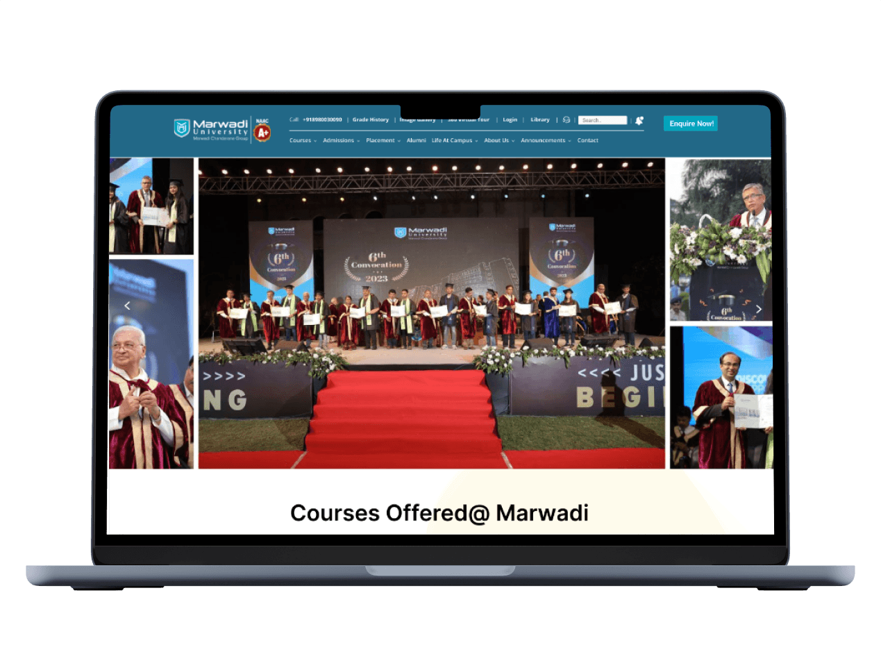
Marwadi University, situated in Rajkot, Gujarat, India, is a prestigious educational institution.
Marwadi University
UX Case Study

Project Type
UX Design & Research
Tech Stack
Figma
Miro
Google Suite
My Role
UX Designer & Researcher
Stakeholder / Client
Academic Project
Key Responsibilities
User Interviews, Usability testing, Heuristic evaluation, Ideation, Wireframing, Prototyping, User research, User personas
Project Timeline
1st
Week
2nd
Week
3rd
Week
4th
Week
5th
Week
6th
Week
7th
Week
8th
Week
9th
Week
10th
Week
11th
Week
12th
Week
UX Design
Strategy
(Research)
Low-fid
Wireframes
Usability
Testing Phase
Visual Design
& Prototyping
Interview, Empathy Map,
User Journey Map
Problem Statement &
Goal Statement
User Personas
User Stories, Accessibility
Audit
UI Design

Redesign UI
Outcomes
The outcomes of the case study for Marwadi University include a significant improvement in user satisfaction and engagement with the university's digital platforms. The redesigned interfaces have led to easier access to information, smoother navigation, and increased usability for students, faculty, and staff. This has resulted in higher levels of user engagement with the university's online resources and improved overall efficiency. The successful implementation of the design solutions has also demonstrated the value of incorporating user-centered design principles in digital platform development, setting a precedent for future projects at Marwadi University.
Heuristic Evaluation
To identify important issues with the current website, a heuristic evaluation was performed. The Jacob Nielsen 10 heuristics for the evaluation method were used because this method is a very time-efficient evaluation method compared to other methods, such as user testing. The severity scale was ranked according to Nielsen’s severity scale. The heuristic evaluation found that there is no visibility of system status. It also discovered issues with user control, consistency, and standards. and error prevention. The main issues identified are flexibility and efficiency of use.
The severity scale was ranked according to Nielsen’s severity scale. This heuristic was rated a 3 on a scale of 0-3, with 0 being a minor issue and 3 being catastrophic. There are several issues with the aesthetic and design including colors, layout, and typefaces.
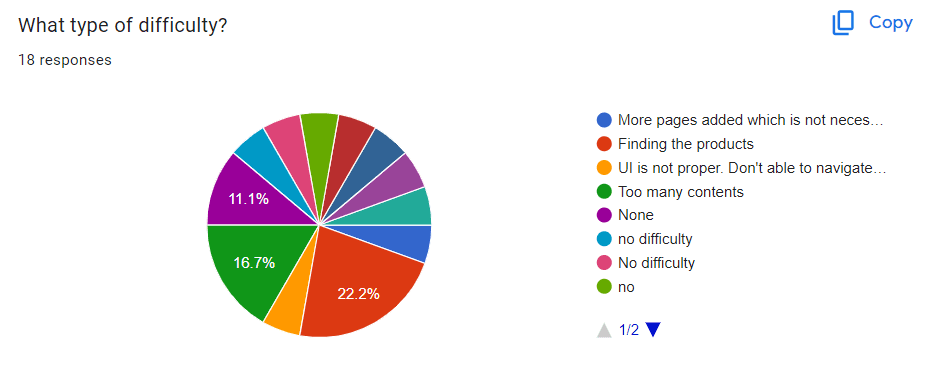
The product pages have a confusing layout. The breadcrumbs were also not well designed. There was no consistency in product technical details. The major issue was that there was not any filter function to find products. Most of the issues were with poor content quality and lack of proper navigation. These issues can be easily resolved with complete information architecture so that users can get an idea about the overall sitemap of the website.
Severity scale
Severity ratings are used to determine how serious a usability issue is. Severity ratings range from cosmetic problems to usability catastrophes.
https://www.nngroup.com/articles/how-to-rate-the-severity-of-usability-problems/
Cosmetic problem: need not be fixed unless extra time is available on project
Minor problem:
fixing this should be given low priority
Major problem: important to fix, so should be given high priority
Usability catastrophe: imperative to fix this before product can be released
Heuristic passed:
I don't agree that this is a usability problem at all
Surveys & Interviews
Who are the users?
We need to understand how students and faculty interact with such features and functionality, what is it that they want from a Marwadi University Website.
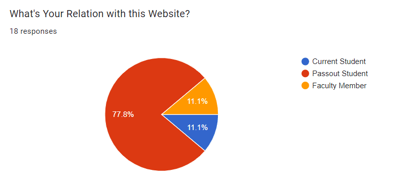
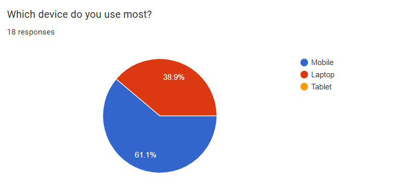
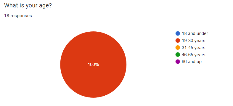
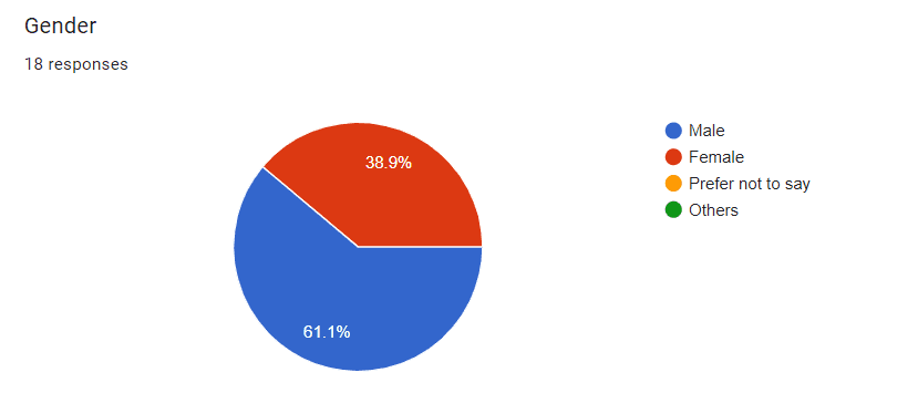
In the next phase of the study, user research was conducted. The purpose of this research was to establish who the current and prospective site users are and what their goals are when visiting the site. Demographic questions revealed that the target users are typically male, with an age range of 19-30 years, either employee or student, have a bachelor’s degree, and are living In Rajkot city. 61.1% of participants were using mobiles.
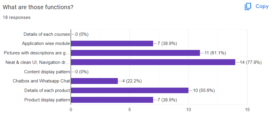
Half of the participants had visited the website of a similar company like this before and the main purpose of the website for the participant was to check products. Target users cited that they would visit the website of Marwadi University because they are interested in checking the updated syllabus, and inquiring about admission, Awards and recognition, and Faculty Details.
Responses
User Personas
Three major users were identified and represented in personas based on the user study.
The three personas are:
The Current student
The Faculty Member
The Pass-out student
User Stories
Based on User Research Data and Personas 9 user stories were created with appropriate acceptance criteria for each.
Personas helped categorize user stories by goals, forming the foundation for scenario creation in usability testing. One/two user story from each persona was selected to cover various aspects of the website, user goals, and validate heuristic evaluation findings.
As a Student,
I want to take some time to do a little research
so that, I can evaluate the course information.
As a student,
I want to efficiently check the course syllabus and, I want a dedicated syllabus section on the university's website
so that, I can quickly access syllabus documents for all my courses. This will help me save time and easily review course requirements and schedules.
As a Professor,
I want the website to have a search feature within the "Awards & Recognitions" section,
so that, I can able to find specific recognitions by keyword or name who occasionally check for awards.
As a Professor for handling new admission inquiries,
I want an organized and user-friendly dashboard,
so that, I can easily display the latest admission requests. This will help me efficiently manage and respond to new inquiries.
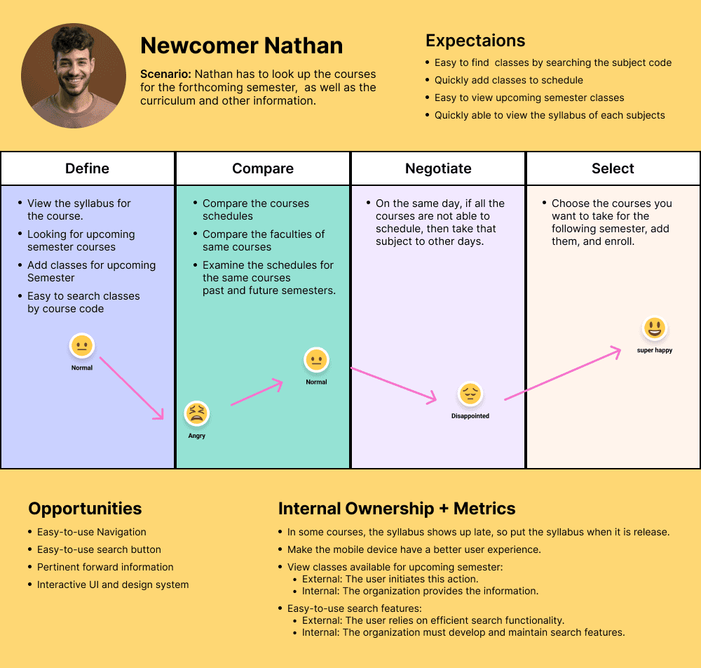
User Journey Map
Usability Testing Materials
Explanation Write-up
There were so many issues that I found during my research. So the first issue that I found during the heuristic evaluation was that On the graduation page, there is no dedicated button to navigate back to the Engineering and Technology section if a user decides to return from the "Know More" page. The main issue was there was not any button to return to the graduation page. This issue is due to the Lack of Visibility of System Status and Lack of User Control and Freedom. Users should have the freedom to explore the website without feeling trapped on a particular page. A back button or a navigation link to the Engineering and Technology section should be provided to maintain user control and inform them about the system's status.
For Detailed Usability Testing Materials visit below document link.
Usability Testing
Following the collection of all data, important concerns were recognized, and remedies were developed.
The grading scale used to assess the effect of each identified issue is shown below.
1. Suggestion: A suggestion that describes a possible enhancement of a fix in the system, but with low importance to the participant.
2. Strong Suggestion: A suggestion to fix something that is clearly annoying the participant.
3. Minor Issue: Participant stops to think, but proceeds.
4. Major Issue: The participant faces a significant delay or starts doing try-and-error.
5. Blocker Issue: The participant gets stuck or gives up, and only proceeds with help.
Task by Task Analysis
11
Usability Issues
6
Scopes
5
Participants
77.5%
Success Rate
8
Tasks
Low-fid Wireframes
Low-fidelity wireframes are simple, basic representations of a design, focusing on structure and layout rather than detailed visuals. They serve as a blueprint for the final design, outlining key elements and interactions.
Let's do some Wireframing!
"Simplify, Structure, Create: Building Blocks of Design."
Recommendations
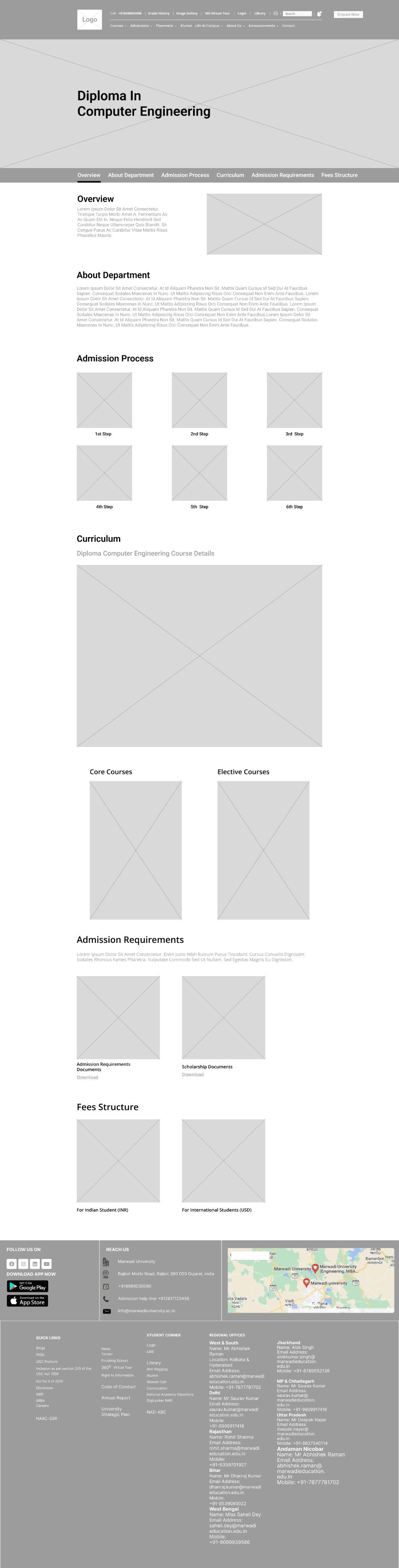
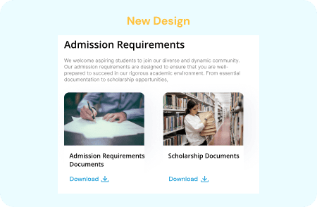
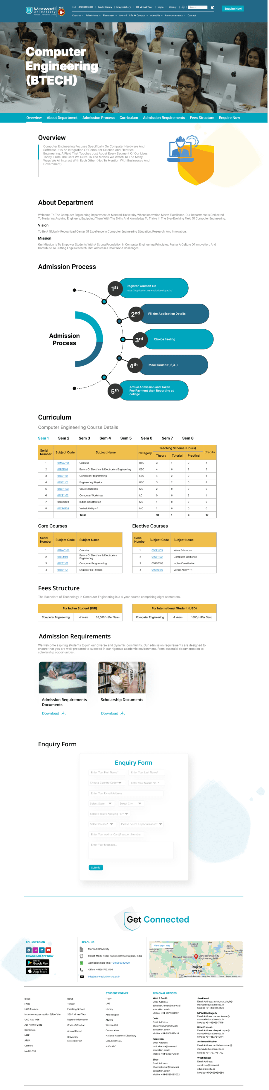
TASK 1 | Admission Requirements
Issues
On the current site, the admission requirements section is not available. Hence, the course details page does not contain the admission requirements, which parents and students cannot find.
Recommendations
Following the usability test, I discovered that some user responses had to do with admission requirements. Following that, I updated the course detail page with a section on admission requirements. which includes documents with the requirements for admission and scholarships, both of which are available for download in PDF format.
Priority
High
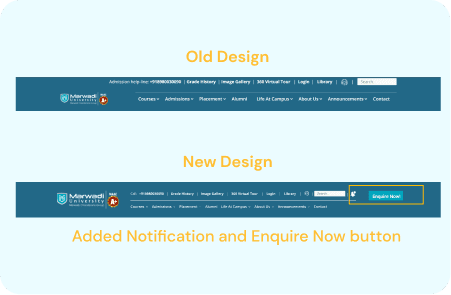
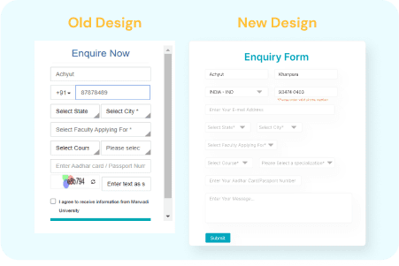
TASK 2 | Notification and Enquire now Button
Issues
There was no notification or "enquire now" button on the original website. Therefore, users are unable to find the "enquire now" form or receive any kind of notification.
Recommendations
In the header, include a notification and an enquire now button. As a result, the user can check the notifications and access the enquiry form with ease.
Priority
High
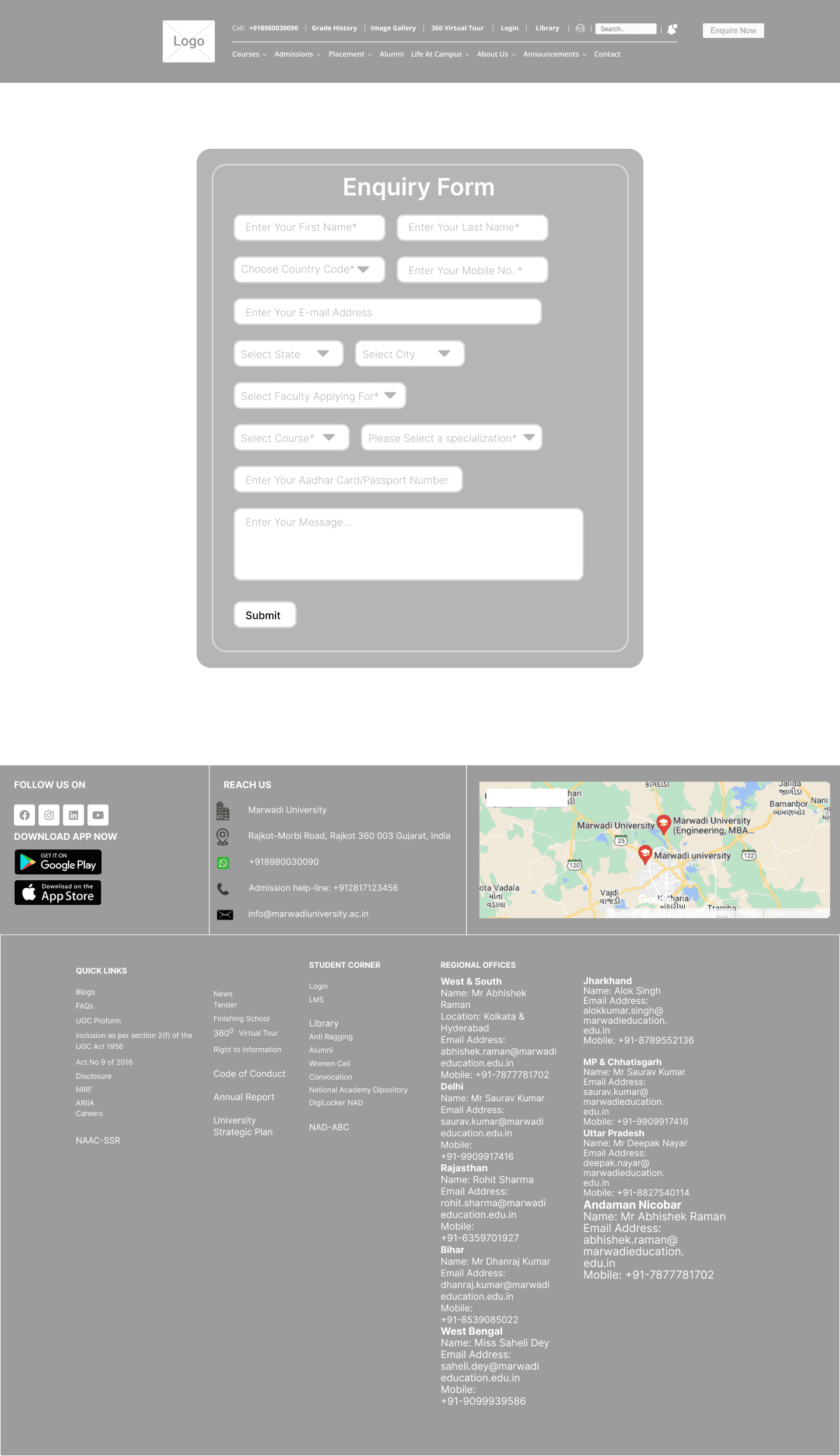
TASK 3 | Enquiry Form
Issues
The error appears in the enquiry form when you click the submit button. Therefore, the user must return to that field, fill in the information, and then click the submit button once more. Additionally, users may find it difficult to read the inquiry form due to its small size.
Recommendations
Testing data indicates that users require an interactive form for inquiries. Since I altered the form's design, if something is missing, an error message appears right away.
Priority
HIgh
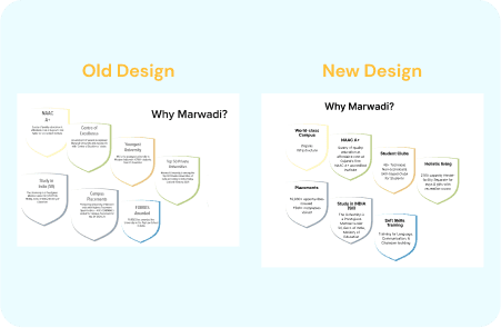
TASK 4 | Why Marwadi?
Issues
The content in the "Why Marwadi?" section of the homepage is uninteresting, which causes users to skip over it.
Recommendations
Based on user feedback, the "why marwadi?" section needs some eye-catching content. I have therefore updated the information in the "Why Marwadi?" section.
Priority
Low
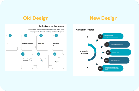
TASK 5 | Admission Process Steps
Issues
The admissions process's steps don't provide users with a clear flow, making it somewhat difficult to understand.
Recommendations
Create a well-organized process that makes it simple to comprehend the steps involved in the admissions process. However, I have revamped the admissions procedure.
Priority
Low
Conclusion
This study's objective was to evaluate the Marwadi University location's present problems and offer suggestions for improvements. This experiment was designed to increase website traffic, draw in new users, solicit inquiries about admissions, and enhance overall usability. Inventory, heuristic testing, and usability testing were used to identify the main issues and develop solutions. Participants were then given the chance to test a prototype that contained the solutions. During the testing, the main pain points on the site were identified as the inquiry form, course information page, finding the syllabus, and downloading syllabus documents.
High-fid Prototype
Following the first round of observational testing, the sections of the site that posed the greatest challenges to users were chosen. Following that, a prototype was constructed in an attempt to address some of the significant concerns and roadblocks that had been discovered. There were four participants in this phase of testing, all of whom had taken part in the first round. Upon first viewing, all four participants commented favorably on the site’s changes. The tasks for the prototype were comparable to those used in the initial testing. There were three scenarios, each with three tasks.
The purpose of the testing on the Marwadi University website was to identify critical issues and discover solutions to boost user engagement and traffic. Over several months, this testing was carried out in multiple phases. From heuristic evaluation to User research, user personas, User story creation, Content inventory, and Usability testing were conducted. After the testing, the data was analyzed to identify the key issues more accurately with the site. With the problems in mind, a high-fidelity prototype was created that addressed the problems by introducing a new design.
Project Overview
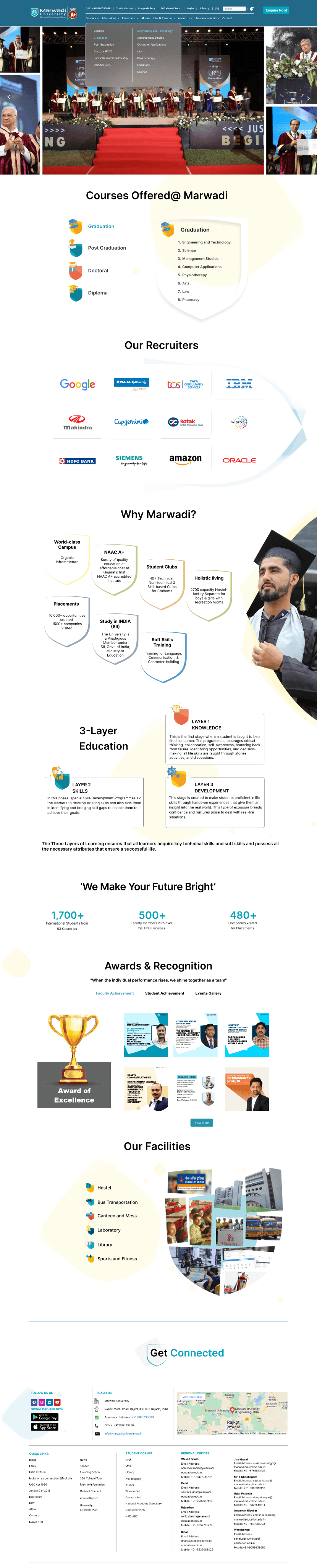
Marwadi University faced challenges in providing an optimal user experience for its students, faculty, and staff through its digital platforms. The existing interfaces were outdated, leading to difficulties in accessing information, navigating the website, and engaging with the university's online resources. This resulted in a subpar user experience, impacting user satisfaction and overall efficiency. The university recognized the need to enhance its digital presence to better serve its community and improve engagement.
Problem Statement
Marwadi University, situated in Rajkot, Gujarat, India, is a prestigious educational institution.
Marwadi University


UX Case Study

Project Type
UX Design & Research
Tech Stack
Figma
Miro
Google Suite
My Role
UX Designer & Researcher
Stakeholder / Client
Academic Project
Key Responsibilities
User Interviews, Usability testing, Heuristic evaluation, Ideation, Wireframing, Prototyping, User research, User personas
The purpose of the testing on the Marwadi University website was to identify critical issues and discover solutions to boost user engagement and traffic. Over several months, this testing was carried out in multiple phases. From heuristic evaluation to User research, user personas, User story creation, Content inventory, and Usability testing were conducted. After the testing, the data was analyzed to identify the key issues more accurately with the site. With the problems in mind, a high-fidelity prototype was created that addressed the problems by introducing a new design.
Project Overview
Marwadi University faced challenges in providing an optimal user experience for its students, faculty, and staff through its digital platforms. The existing interfaces were outdated, leading to difficulties in accessing information, navigating the website, and engaging with the university's online resources. This resulted in a subpar user experience, impacting user satisfaction and overall efficiency. The university recognized the need to enhance its digital presence to better serve its community and improve engagement.
Problem Statement
Project Timeline
1st
Week
2nd
Week
3rd
Week
4th
Week
5th
Week
6th
Week
7th
Week
8th
Week
9th
Week
10th
Week
11th
Week
12th
Week
UX Design
Strategy
(Research)
Low-fid
Wireframes
Usability
Testing Phase
Visual Design
& Prototyping
Interview, Empathy Map,
User Journey Map
Problem Statement &
Goal Statement
User Personas
User Stories, Accessibility
Audit
UI Design

Redesign UI
Outcomes
The outcomes of the case study for Marwadi University include a significant improvement in user satisfaction and engagement with the university's digital platforms. The redesigned interfaces have led to easier access to information, smoother navigation, and increased usability for students, faculty, and staff. This has resulted in higher levels of user engagement with the university's online resources and improved overall efficiency. The successful implementation of the design solutions has also demonstrated the value of incorporating user-centered design principles in digital platform development, setting a precedent for future projects at Marwadi University.
Heuristic Evaluation
To identify important issues with the current website, a heuristic evaluation was performed. The Jacob Nielsen 10 heuristics for the evaluation method were used because this method is a very time-efficient evaluation method compared to other methods, such as user testing. The severity scale was ranked according to Nielsen’s severity scale. The heuristic evaluation found that there is no visibility of system status. It also discovered issues with user control, consistency, and standards. and error prevention. The main issues identified are flexibility and efficiency of use.
The severity scale was ranked according to Nielsen’s severity scale. This heuristic was rated a 3 on a scale of 0-3, with 0 being a minor issue and 3 being catastrophic. There are several issues with the aesthetic and design including colors, layout, and typefaces.
The product pages have a confusing layout. The breadcrumbs were also not well designed. There was no consistency in product technical details. The major issue was that there was not any filter function to find products. Most of the issues were with poor content quality and lack of proper navigation. These issues can be easily resolved with complete information architecture so that users can get an idea about the overall sitemap of the website.
Severity scale
Severity ratings are used to determine how serious a usability issue is. Severity ratings range from cosmetic problems to usability catastrophes.
https://www.nngroup.com/articles/how-to-rate-the-severity-of-usability-problems/
Cosmetic problem: need not be fixed unless extra time is available on project
Minor problem:
fixing this should be given low priority
Major problem: important to fix, so should be given high priority
Usability catastrophe: imperative to fix this before product can be released
Heuristic passed:
I don't agree that this is a usability problem at all
Surveys & Interviews
Who are the users?
We need to understand how students and faculty interact with such features and functionality, what is it that they want from a Marwadi University Website.
In the next phase of the study, user research was conducted. The purpose of this research was to establish who the current and prospective site users are and what their goals are when visiting the site. Demographic questions revealed that the target users are typically male, with an age range of 19-30 years, either employee or student, have a bachelor’s degree, and are living In Rajkot city. 61.1% of participants were using mobiles.
Half of the participants had visited the website of a similar company like this before and the main purpose of the website for the participant was to check products. Target users cited that they would visit the website of Marwadi University because they are interested in checking the updated syllabus, and inquiring about admission, Awards and recognition, and Faculty Details.
Responses
User Personas
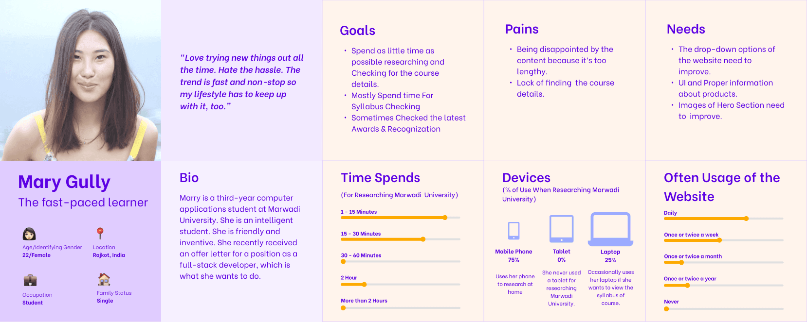
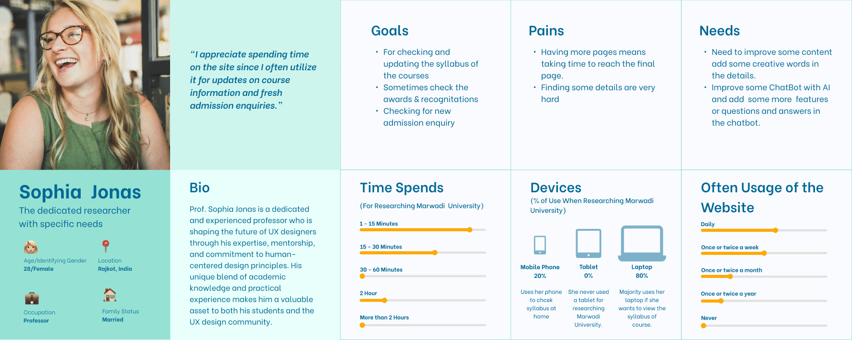
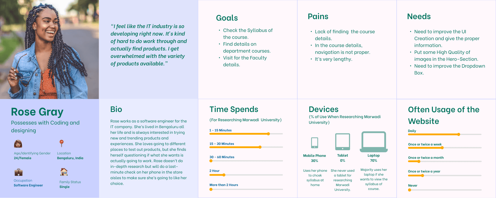
Three major users were identified and represented in personas based on the user study.
The three personas are:
The Current student
The Faculty Member
The Pass-out student
User Stories
Based on User Research Data and Personas 9 user stories were created with appropriate acceptance criteria for each.
Personas helped categorize user stories by goals, forming the foundation for scenario creation in usability testing. One/two user story from each persona was selected to cover various aspects of the website, user goals, and validate heuristic evaluation findings.
As a Student,
I want to take some time to do a little research
so that, I can evaluate the course information.
As a student,
I want to efficiently check the course syllabus and, I want a dedicated syllabus section on the university's website
so that, I can quickly access syllabus documents for all my courses. This will help me save time and easily review course requirements and schedules.
As a Professor,
I want the website to have a search feature within the "Awards & Recognitions" section,
so that, I can able to find specific recognitions by keyword or name who occasionally check for awards.
As a Professor for handling new admission inquiries,
I want an organized and user-friendly dashboard,
so that, I can easily display the latest admission requests. This will help me efficiently manage and respond to new inquiries.
User Journey Map
Usability Testing Materials
Explanation Write-up
There were so many issues that I found during my research. So the first issue that I found during the heuristic evaluation was that On the graduation page, there is no dedicated button to navigate back to the Engineering and Technology section if a user decides to return from the "Know More" page. The main issue was there was not any button to return to the graduation page. This issue is due to the Lack of Visibility of System Status and Lack of User Control and Freedom. Users should have the freedom to explore the website without feeling trapped on a particular page. A back button or a navigation link to the Engineering and Technology section should be provided to maintain user control and inform them about the system's status.
For Detailed Usability Testing Materials visit below document link.
Usability Testing
Following the collection of all data, important concerns were recognized, and remedies were developed.
The grading scale used to assess the effect of each identified issue is shown below.
1. Suggestion: A suggestion that describes a possible enhancement of a fix in the system, but with low importance to the participant.
2. Strong Suggestion: A suggestion to fix something that is clearly annoying the participant.
3. Minor Issue: Participant stops to think, but proceeds.
4. Major Issue: The participant faces a significant delay or starts doing try-and-error.
5. Blocker Issue: The participant gets stuck or gives up, and only proceeds with help.
Task by Task Analysis
11
Usability Issues
6
Scopes
5
Participants
77.5%
Success Rate
8
Tasks
Low-fid Wireframes
Low-fidelity wireframes are simple, basic representations of a design, focusing on structure and layout rather than detailed visuals. They serve as a blueprint for the final design, outlining key elements and interactions.
Let's do some Wireframing!
"Simplify, Structure, Create: Building Blocks of Design."
High-fid Prototype
Following the first round of observational testing, the sections of the site that posed the greatest challenges to users were chosen. Following that, a prototype was constructed in an attempt to address some of the significant concerns and roadblocks that had been discovered. There were four participants in this phase of testing, all of whom had taken part in the first round. Upon first viewing, all four participants commented favorably on the site’s changes. The tasks for the prototype were comparable to those used in the initial testing. There were three scenarios, each with three tasks.
Recommendations
TASK 1 | Admission Requirements
Issues
On the current site, the admission requirements section is not available. Hence, the course details page does not contain the admission requirements, which parents and students cannot find.
Recommendations
Following the usability test, I discovered that some user responses had to do with admission requirements. Following that, I updated the course detail page with a section on admission requirements. which includes documents with the requirements for admission and scholarships, both of which are available for download in PDF format.
Priority
High
TASK 2 | Notification and Enquire now Button
Issues
There was no notification or "enquire now" button on the original website. Therefore, users are unable to find the "enquire now" form or receive any kind of notification.
Recommendations
In the header, include a notification and an enquire now button. As a result, the user can check the notifications and access the enquiry form with ease.
Priority
High
TASK 3 | Enquiry Form
Issues
The error appears in the enquiry form when you click the submit button. Therefore, the user must return to that field, fill in the information, and then click the submit button once more. Additionally, users may find it difficult to read the inquiry form due to its small size.
Recommendations
Testing data indicates that users require an interactive form for inquiries. Since I altered the form's design, if something is missing, an error message appears right away.
Priority
High
TASK 4 | Why Marwadi?
Issues
The content in the "Why Marwadi?" section of the homepage is uninteresting, which causes users to skip over it.
Recommendations
Based on user feedback, the "why marwadi?" section needs some eye-catching content. I have therefore updated the information in the "Why Marwadi?" section.
Priority
Low
TASK 5 | Admission Process Steps
Issues
The admissions process's steps don't provide users with a clear flow, making it somewhat difficult to understand.
Recommendations
Create a well-organized process that makes it simple to comprehend the steps involved in the admissions process. However, I have revamped the admissions procedure.
Priority
Low
TASK 6 | Repetition
Issues
Users may notice some repetition on the page because Awards & Recognition is repeated on every course details page on the current website.
Recommendations
I got some feedback from users, and they advised me to take the Awards & Recognition section away from each course detail page since it is on the main page. Repetition is felt. I thus deleted that section from the course details page during the redesign.
Priority
Medium
Conclusion
This study's objective was to evaluate the Marwadi University location's present problems and offer suggestions for improvements. This experiment was designed to increase website traffic, draw in new users, solicit inquiries about admissions, and enhance overall usability. Inventory, heuristic testing, and usability testing were used to identify the main issues and develop solutions. Participants were then given the chance to test a prototype that contained the solutions. During the testing, the main pain points on the site were identified as the inquiry form, course information page, finding the syllabus, and downloading syllabus documents.
What did I learn?
Consistency is key: The study revealed that the university's branding was not consistent across all channels, including its website, and marketing materials. By establishing a consistent brand image, the university can build a stronger brand identity and improve user recognition and trust.
User-centered design is important: The study found that the University's website was not designed with the user in mind. By adopting a user-centered design approach, the university can create a website that is more intuitive, easier to use, and better aligned with user needs and expectations.
Visuals are powerful: The study revealed that users responded positively to visual content, such as photos of the company's work. By incorporating more visual content into its website and marketing materials, the company can engage users and showcase its expertise and capabilities.
Marwadi University, situated in Rajkot, Gujarat, India, is a prestigious educational institution.
Marwadi University
UX Case Study


Project Type
UX Design & Research
Tech Stack
Figma
Miro
Google Suite
My Role
UX Designer & Researcher
Stakeholder / Client
Academic Project
Key Responsibilities
User Interviews, Usability testing, Heuristic evaluation, Ideation, Wireframing, Prototyping, User research, User personas
The purpose of the testing on the Marwadi University website was to identify critical issues and discover solutions to boost user engagement and traffic. Over several months, this testing was carried out in multiple phases. From heuristic evaluation to User research, user personas, User story creation, Content inventory, and Usability testing were conducted. After the testing, the data was analyzed to identify the key issues more accurately with the site. With the problems in mind, a high-fidelity prototype was created that addressed the problems by introducing a new design.
Project Overview
Marwadi University faced challenges in providing an optimal user experience for its students, faculty, and staff through its digital platforms. The existing interfaces were outdated, leading to difficulties in accessing information, navigating the website, and engaging with the university's online resources. This resulted in a subpar user experience, impacting user satisfaction and overall efficiency. The university recognized the need to enhance its digital presence to better serve its community and improve engagement.
Problem Statement
Project Timeline
1st
Week
2nd
Week
3rd
Week
4th
Week
5th
Week
6th
Week
7th
Week
8th
Week
9th
Week
10th
Week
11th
Week
12th
Week
UX Design
Strategy
(Research)
Low-fid
Wireframes
Usability
Testing Phase
Visual Design
& Prototyping
Interview, Empathy Map,
User Journey Map
Problem Statement &
Goal Statement
User Personas
User Stories, Accessibility
Audit
UI Design
Redesign UI
Outcomes
The outcomes of the case study for Marwadi University include a significant improvement in user satisfaction and engagement with the university's digital platforms. The redesigned interfaces have led to easier access to information, smoother navigation, and increased usability for students, faculty, and staff. This has resulted in higher levels of user engagement with the university's online resources and improved overall efficiency. The successful implementation of the design solutions has also demonstrated the value of incorporating user-centered design principles in digital platform development, setting a precedent for future projects at Marwadi University.
Heuristic Evaluation
To identify important issues with the current website, a heuristic evaluation was performed. The Jacob Nielsen 10 heuristics for the evaluation method were used because this method is a very time-efficient evaluation method compared to other methods, such as user testing. The severity scale was ranked according to Nielsen’s severity scale. The heuristic evaluation found that there is no visibility of system status. It also discovered issues with user control, consistency, and standards. and error prevention. The main issues identified are flexibility and efficiency of use.
The severity scale was ranked according to Nielsen’s severity scale. This heuristic was rated a 3 on a scale of 0-3, with 0 being a minor issue and 3 being catastrophic. There are several issues with the aesthetic and design including colors, layout, and typefaces.
The product pages have a confusing layout. The breadcrumbs were also not well designed. There was no consistency in product technical details. The major issue was that there was not any filter function to find products. Most of the issues were with poor content quality and lack of proper navigation. These issues can be easily resolved with complete information architecture so that users can get an idea about the overall sitemap of the website.
Severity scale
Severity ratings are used to determine how serious a usability issue is. Severity ratings range from cosmetic problems to usability catastrophes.
https://www.nngroup.com/articles/how-to-rate-the-severity-of-usability-problems/
Cosmetic problem: need not be fixed unless extra time is available on project
Minor problem:
fixing this should be given low priority
Major problem: important to fix, so should be given high priority
Usability catastrophe: imperative to fix this before product can be released
Heuristic passed:
I don't agree that this is a usability problem at all
Surveys & Interviews
Who are the users?
We need to understand how students and faculty interact with such features and functionality, what is it that they want from a Marwadi University Website.
In the next phase of the study, user research was conducted. The purpose of this research was to establish who the current and prospective site users are and what their goals are when visiting the site. Demographic questions revealed that the target users are typically male, with an age range of 19-30 years, either employee or student, have a bachelor’s degree, and are living In Rajkot city. 61.1% of participants were using mobiles.
Half of the participants had visited the website of a similar company like this before and the main purpose of the website for the participant was to check products. Target users cited that they would visit the website of Marwadi University because they are interested in checking the updated syllabus, and inquiring about admission, Awards and recognition, and Faculty Details.
Responses
User Personas
Three major users were identified and represented in personas based on the user study.
The three personas are:
The Current student
The Faculty Member
The Graduted student
User Stories
Based on User Research Data and Personas 9 user stories were created with appropriate acceptance criteria for each.
Personas helped categorize user stories by goals, forming the foundation for scenario creation in usability testing. One/two user story from each persona was selected to cover various aspects of the website, user goals, and validate heuristic evaluation findings.
As a Student,
I want to take some time to do a little research
so that, I can evaluate the course information.
As a student,
I want to efficiently check the course syllabus and, I want a dedicated syllabus section on the university's website
so that, I can quickly access syllabus documents for all my courses. This will help me save time and easily review course requirements and schedules.
As a Professor,
I want the website to have a search feature within the "Awards & Recognitions" section,
so that, I can able to find specific recognitions by keyword or name who occasionally check for awards.
As a Professor for handling new admission inquiries,
I want an organized and user-friendly dashboard,
so that, I can easily display the latest admission requests. This will help me efficiently manage and respond to new inquiries.
User Journey Map
Usability Testing Materials
Explanation Write-up
There were so many issues that I found during my research. So the first issue that I found during the heuristic evaluation was that On the graduation page, there is no dedicated button to navigate back to the Engineering and Technology section if a user decides to return from the "Know More" page. The main issue was there was not any button to return to the graduation page. This issue is due to the Lack of Visibility of System Status and Lack of User Control and Freedom. Users should have the freedom to explore the website without feeling trapped on a particular page. A back button or a navigation link to the Engineering and Technology section should be provided to maintain user control and inform them about the system's status.
For Detailed Usability Testing Materials visit below document link.
Usability Testing
Following the collection of all data, important concerns were recognized, and remedies were developed.
The grading scale used to assess the effect of each identified issue is shown below.
1. Suggestion: A suggestion that describes a possible enhancement of a fix in the system, but with low importance to the participant.
2. Strong Suggestion: A suggestion to fix something that is clearly annoying the participant.
3. Minor Issue: Participant stops to think, but proceeds.
4. Major Issue: The participant faces a significant delay or starts doing try-and-error.
5. Blocker Issue: The participant gets stuck or gives up, and only proceeds with help.
Task by Task Analysis
11
Usability Issues
6
Scopes
5
Participants
77.5%
Success Rate
8
Tasks
Low-fid Wireframes
Low-fidelity wireframes are simple, basic representations of a design, focusing on structure and layout rather than detailed visuals. They serve as a blueprint for the final design, outlining key elements and interactions.
Let's do some Wireframing!
"Simplify, Structure, Create: Building Blocks of Design."
High-fid Prototype
Following the first round of observational testing, the sections of the site that posed the greatest challenges to users were chosen. Following that, a prototype was constructed in an attempt to address some of the significant concerns and roadblocks that had been discovered. There were four participants in this phase of testing, all of whom had taken part in the first round. Upon first viewing, all four participants commented favorably on the site’s changes. The tasks for the prototype were comparable to those used in the initial testing. There were three scenarios, each with three tasks.
Recommendations
TASK 1 | Admission Requirements
Issues
On the current site, the admission requirements section is not available. Hence, the course details page does not contain the admission requirements, which parents and students cannot find.
Recommendations
Following the usability test, I discovered that some user responses had to do with admission requirements. Following that, I updated the course detail page with a section on admission requirements. which includes documents with the requirements for admission and scholarships, both of which are available for download in PDF format.
Priority
High
TASK 2 | Notification and Enquire now Button
Issues
There was no notification or "enquire now" button on the original website. Therefore, users are unable to find the "enquire now" form or receive any kind of notification.
Recommendations
In the header, include a notification and an enquire now button. As a result, the user can check the notifications and access the enquiry form with ease.
Priority
High
TASK 3 | Enquiry Form
Issues
The error appears in the enquiry form when you click the submit button. Therefore, the user must return to that field, fill in the information, and then click the submit button once more. Additionally, users may find it difficult to read the inquiry form due to its small size.
Recommendations
Testing data indicates that users require an interactive form for inquiries. Since I altered the form's design, if something is missing, an error message appears right away.
Priority
High
TASK 4 | Why Marwadi?
Issues
The content in the "Why Marwadi?" section of the homepage is uninteresting, which causes users to skip over it.
Recommendations
Based on user feedback, the "why marwadi?" section needs some eye-catching content. I have therefore updated the information in the "Why Marwadi?" section.
Priority
Low
TASK 5 | Admission Process Steps
Issues
The admissions process's steps don't provide users with a clear flow, making it somewhat difficult to understand.
Recommendations
Create a well-organized process that makes it simple to comprehend the steps involved in the admissions process. However, I have revamped the admissions procedure.
Priority
Low
TASK 6 | Repetition
Issues
Users may notice some repetition on the page because Awards & Recognition is repeated on every course details page on the current website.
Recommendations
I got some feedback from users, and they advised me to take the Awards & Recognition section away from each course detail page since it is on the main page. Repetition is felt. I thus deleted that section from the course details page during the redesign.
Priority
Medium
Conclusion
This study's objective was to evaluate the Marwadi University location's present problems and offer suggestions for improvements. This experiment was designed to increase website traffic, draw in new users, solicit inquiries about admissions, and enhance overall usability. Inventory, heuristic testing, and usability testing were used to identify the main issues and develop solutions. Participants were then given the chance to test a prototype that contained the solutions. During the testing, the main pain points on the site were identified as the inquiry form, course information page, finding the syllabus, and downloading syllabus documents.
What did I learn?
Consistency is key: The study revealed that the university's branding was not consistent across all channels, including its website, and marketing materials. By establishing a consistent brand image, the university can build a stronger brand identity and improve user recognition and trust.
User-centered design is important: The study found that the University's website was not designed with the user in mind. By adopting a user-centered design approach, the university can create a website that is more intuitive, easier to use, and better aligned with user needs and expectations.
Visuals are powerful: The study revealed that users responded positively to visual content, such as photos of the company's work. By incorporating more visual content into its website and marketing materials, the company can engage users and showcase its expertise and capabilities.